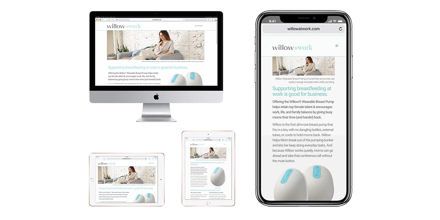
It is well known that smartphones and tablets have now taken up a large percentage as the means most used by internet users to navigate on it. Most people today report using their cell phone to complete its purchases but also to browse the World Wide Web. For this reason there is a great need to customize our websites accordingly, so that each user can have the exact same navigation experience using his mobile device, with the one he would have if they used his desktop computer or laptop.
- What do we mean when we say that a website has Responsive Design. (RWD)
So to meet this need mentioned above, a webpage has to be more mobile friendly. Adjust it so that the menu, its contents and graphics, appear exactly the same on any screen, regardless of size and at the same time be equally useful on all devices. In other words, the website has a Responsive Design.
Google itself, the largest search engine, since 2016 ..does not rank well those websites that do not have Responsive Design. This means that if your website is lagging behind and does not have RWD you should hurry to change it otherwise .. it will be getting ever more difficult to rank in the search results.
This technique, in addition to creating a pleasant browsing experience, has many additional advantages.
- Lower construction and maintenance costs.
In fact, we have two pages for the price of one! We have two websites – mobile and desktop – just by creating one which has RWD so our business saves money that would be wasted to create two different pages and in addition our technician has to deal with and maintain one page instead of two.
- Better SEO, at a lower cost.
We provide search engines with a website with a single URL so it is easier to organize its content and prevent errors in case of multiple versions of the same page with different URLs. In addition, since there are no multiple versions, separate SEO campaigns are not required.
Finally, it is lifesaving for overloaded websites with information and in addition, since the website is designed to adapt equally well to any device and dimension, whatever device – in whatever dimension – is created in the future, will be able to support it so it saves you from future expenses!
One downside however might be that it is not 100% optimized for mobile phones.
- What do we mean when we say Mobile First Design
Now that we know what RWD is we can explain what Mobile First Design is! That is, when we give priority to the construction of a website for mobile devices, to then adjust its features to serve both tablet or desktop.
It specifically:
- It is similar to the design of mobile applications – IOS, Android, Hybrid – but it is much cheaper.
- It clearly aims to provide the best possible touch screen experience to serve users who choose their mobile phones for their internet browsing
- It is fast and contains rich media content to gain the interest of users.
Its negative feature is that it is not 100% optimized for desktop. It is also not suitable for websites that are overloaded with data.
Although people often confuse the two concepts RWD and Mobile First or often even think that they are the same thing, they are two related, but seperate things. Anyway, before we get to that, we need to look at the needs of the audience we target, to control how they visit our page – from their desktop computer or on the move- even if they use wifi or data. Then we will be able to choose which design is right!